5.2 VISUALIZATION
5.2.1 THE MSEE VISUALIZER
The human brain is an excellent processor of visual information, even when a large amount of data is displayed at once. Visual indications are strongly preferable over text, particularly when presenting an evaluation of a three dimensional CAD model.
Every critique of all the features were originally displayed in a single body of text. However, it was clear that this was inadequate because the designer had to be able to map the critique back to the appropriate feature. Because the identifying name given to each rib and boss was arbitrarily assigned by the feature extractor, there was no common reference for the designer.
A concurrent presentation of critiqued feature and text was originally developed as a slide show. Each critique had its own "slide" to be presented by the PHIGS-based "See" utility, with each critiqued part having a "carousel" of slides. The designer would page through each slide to view each feature and associated critique.
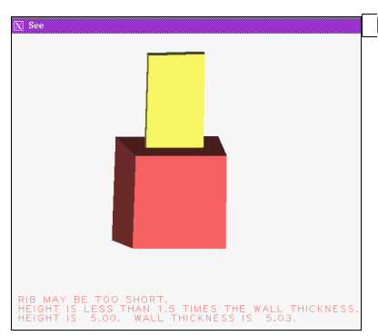
To build the set of slides, the whole model was overlaid with a single, identified feature that was covered red. Additionally, text of a critique associated with that model was included to be displayed with the See viewing window along with the model. A different slide was developed for each critique.
Figure 51 illustrates the introductory screen to the slide show, and Figure 52 illustrates a slide of a single ribbed part, with the rib highlighted in red, and its message. While the slide show accomplished the mapping between feature and critique, it was awkward to use. The design engineers requested that a more immediate association between the model and its critiques be present.
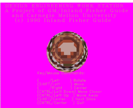
Figure 52 Original Slide Presentation
The MSee viewing utility was developed to allow a more natural interplay between the designer and the critiqued artifact. The entire part and its recognized features are available to the user; the model itself is used as a basis of expressing evaluations. Using the MSee component of the DFM system, critiqued elements are highlighted on the model within the visual display. The user can click upon a given feature to select and then call up a text window with a critique of that feature.
Selective interaction with a model permits a more focussed examination of that model. Pointing to a feature and clicking with the mouse will select that feature. Subsequently, critiques specific to the selected feature can be perused. The See interactive 3D interface and MSee menus are illustrated in the following two figures. The MSee window provides a user- friendly interface for manipulation of objects in the See window.
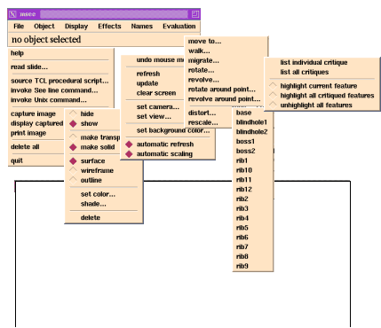
Figure 54 MSee Interactive Display of Features
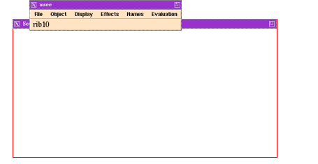
Figure 53 illustrates the MSee menu bar and the various pulldown menus. Most of the options pertain to manipulation of the image, the latter two menu selections from the menu bar refer specifically to the part under examination. The Names pulldown indicates the various objects represented on the display. Each feature and the base has a unique name. The Evaluation menus invoke text windows with critiques, or allow the user to specify the mode by which a problematic feature is highlighted or not-highlighted.
Figure 54 further illustrates the display of the interactive viewing application. Features recognized from an actual GM part are evident, although the actual depiction is much more lucid when seen in its usual color and three dimensions.
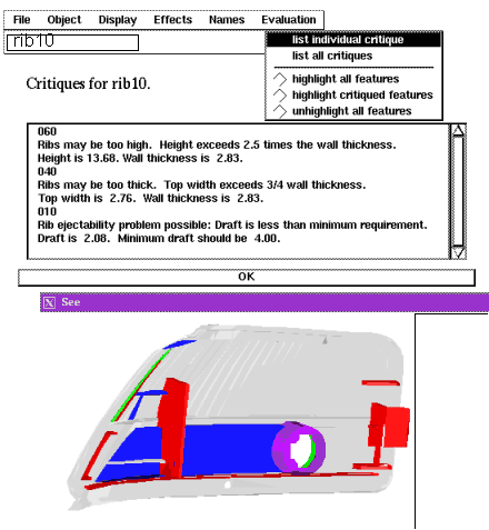
To examine the critiques of an individual feature, the feature is first chosen either by clicking the mouse upon the feature's image or by selecting the name of the feature from the Names menu selection. After feature selection, an Evaluation menu choice as illustrated in Figure 55 is made to display the individual feature's critique. The critiques are shown in a separate, scrollable window as also depicted in the rib critique display of Figure 55.
Figure 55 Textual Display of Critique
